
In clinical studies usually a large number of data is generated. The challenging part is then to present the data in a structured and condensed way, to be able to show as much information as possible in an easily understandable manner. This can be achieved much better using graphical visualization than by using tables.
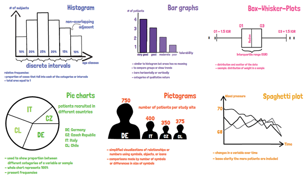
The most frequently used graphical visualization is the histogram. A histogram is a representation of tabulated frequencies, shown as adjacent rectangles, drawn over discrete intervals. The area is proportional to the frequency of the observations within the interval. A histogram may also be normalized displaying relative frequencies. It then shows the proportion of cases that fall into each of the categories or intervals, with the total area equal to 1. The categories are usually specified as consecutive, non-overlapping intervals of a variable. They must be adjacent and are usually chosen to be of the same size.
Bar graphs are used to present categorical data, similar to a histogram, but the area has no meaning. Here plain numbers are shown, to compare groups or show trends. The bars can be plotted horizontally or vertically. Categories are usually of qualitative nature.
Another frequently used visualization of data are the Box-Whisker-plots. They reflect the distribution and scatter of data. The box extends from the lower quartile to the upper quartile. The line within the box is usually marking the median. The Whiskers show the minimum and maximum values. Box-Whisker plots can give a clear overview of the data distribution.
Pie charts are used to show proportions, for example between different categories of a variable or sample. The whole chart represents 100 percent, whereas certain degrees divided by 360 degree of the full circle provide the percent for the distinct groups. Pie charts are basically just another way to present frequencies. They are frequently used but less intuitive since it is harder to compare areas in a circle for the human brain.
Pictograms are simplified visualizations of relationships or numbers using symbols, objects, or icons. Comparisons are made by the number of symbols or differences in the size of the symbols. It allows additional information to be presented such as the context of the graphic but may be misleading and may make comparisons more difficult to identify at a glance.
Spaghetti plots are used to show changes in a certain variable over time. The advantage is, that it can be shown for several patients in the same plot. The change in time for example of the blood pressure for one person is then easy to follow. When interpreting these plots, the axis should always be considered, since on a very small scale differences might appear larger. Spaghetti plots lose their clarity the more patients are included, and as such it is not recommended to be used for a large number of patients.
If you are interested in a visual presentation of this topic, please feel free to follow us on our GCP Mindset YouTube channel! If you would like to know more about how we could implement statistics in your clinical trial, send us a mail to statistics@gcp-service.com.